Recipe Research: Hong Kong Egg Tarts (Dan Tat)

1) Recipe Content

Hong Kong Egg Tarts

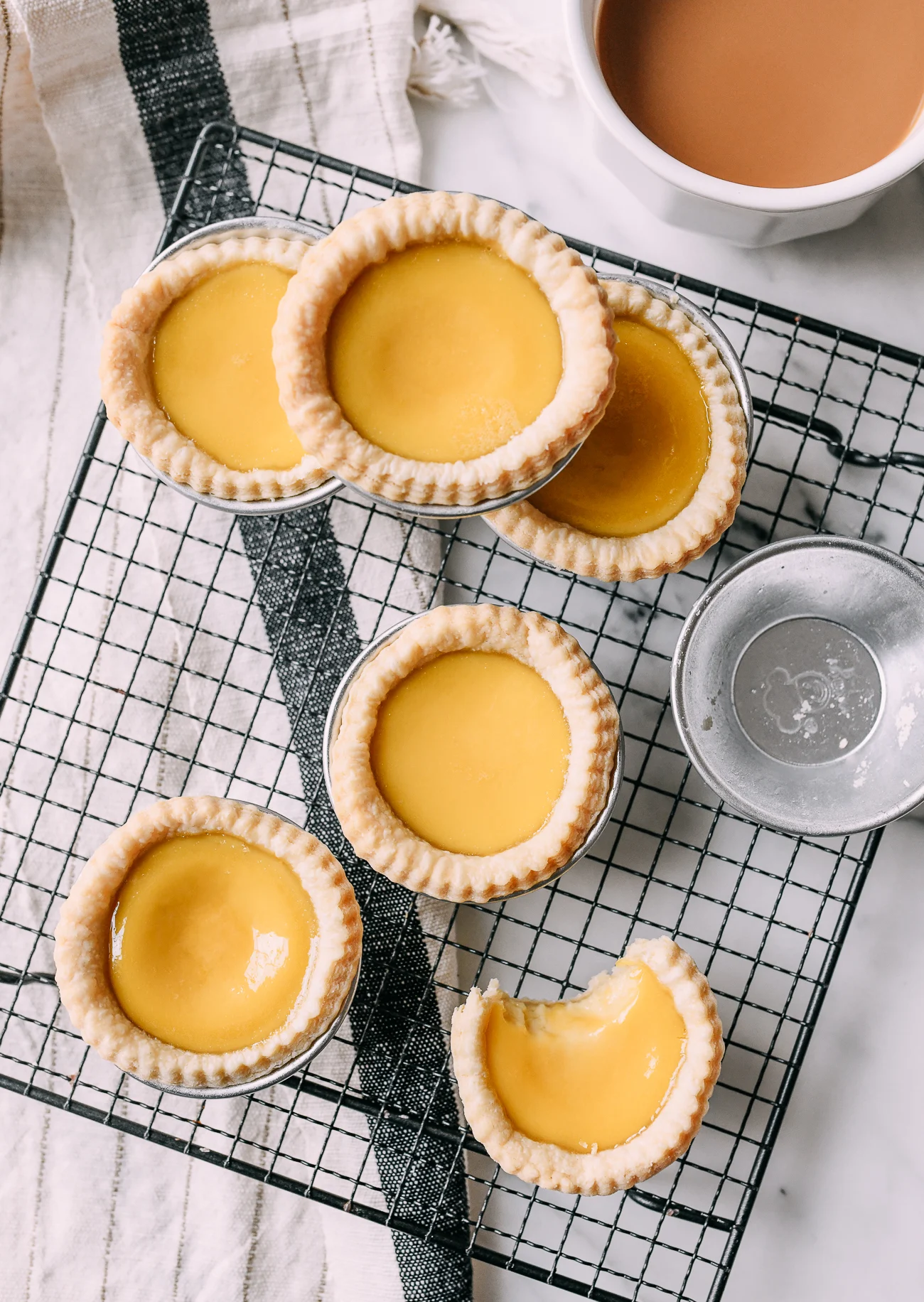
Description: Hong-Kong style egg tarts, or dan tat in Cantonese, are a dim sum staple. They are often enjoyed as a snack or dessert, with a flaky crust and a creamy custard filling that is both sweet and slightly savory.

Ingredients

  • 2 cups all-purpose flour (fluffed and spooned into measuring cup)
  • 1/8 teaspoon salt
  • 12 tablespoons unsalted butter (slightly softened)
  • 2 tablespoons cold water
  • 1/2 cup granulated sugar
  • 1 cup hot water
  • 1/2 cup evaporated milk (at room temperature)
  • 3 large eggs (at room temperature)
  • 1 teaspoon vanilla extract

Instructions

  1. In a bowl, combine the flour and salt. The butter should be just soft enough that it gives when you press it, but not so soft that it collapses. Basically, you want it to be soft enough to break up with your fingers, but it shouldn’t immediately form a paste with the flour.
  2. Cut the butter into small cubes, and add it to the flour and salt. Working quickly, break it up roughly with your fingers until it resembles coarse crumbs with some pea-sized chunks of butter still in the mixture.
  3. Add 2 tablespoons of cold water, and bring the dough together with your hands. Add a little more water if necessary (start with 1/2 teaspoon), no more than 3 teaspoons. At this point, the dough will be scraggly and dry. Wrap tightly and refrigerate for 20 minutes.
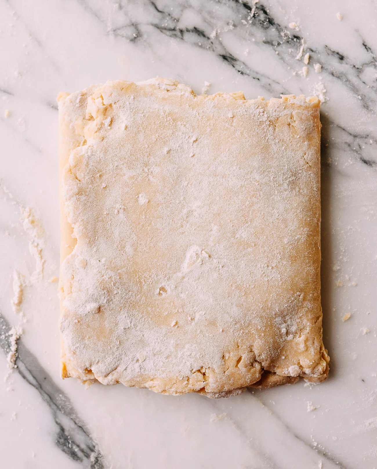
  4. On a lightly floured surface, roll the dough into a roughly 6×15 inch rectangle. Work quickly to avoid overworking it.
  5. Fold the top third down to the center, then the bottom third up and over. Give the dough a quarter turn (left or right) and roll out again to a 6×15 inch rectangle. Fold the same way as before, cover, and chill for 1 hour.
  6. While the dough is resting, make the filling. Dissolve the sugar into 1 cup of hot water, and allow the mixture to cool to room temperature. Whisk evaporated milk, eggs, and vanilla together, then whisk in the sugar water. Strain into a measuring cup or pitcher. You should have about 2 to 2 1/4 cups of custard.
  7. Preheat the oven to 375°F / 190°C, and position a rack in the lower third of your oven.
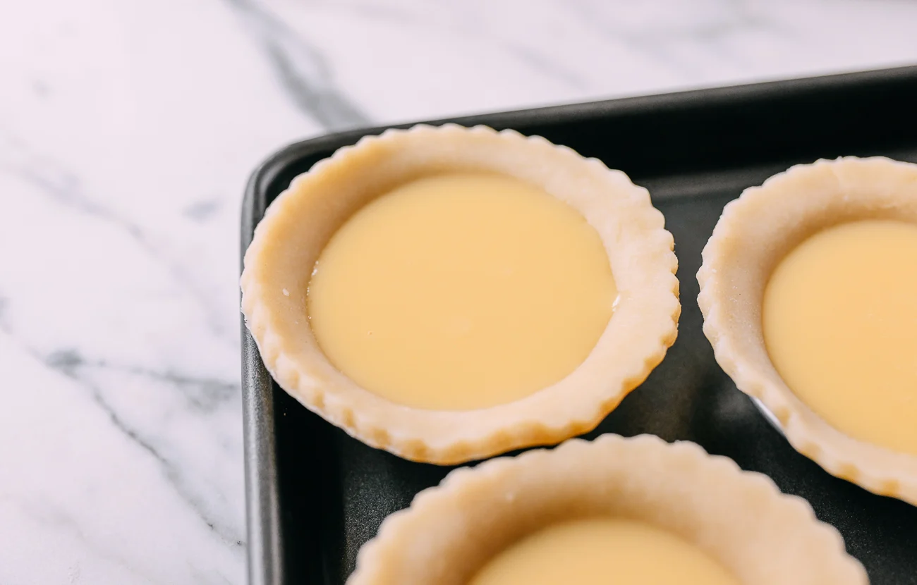
  8. Roll out the dough 0.2 inch / 5mm thick, and cut into 4-inch circles to fit mini tart tins or a shallow non-stick standard muffin pan, leaving a lip over the top. Re-roll scraps as needed until you have around 16 circles.
  9. Evenly fill the tart shells about three quarters full. If you have an ample lip of dough at the top, you can fill until you reach where the dough curves outward.
  10. Immediately (very slowly and carefully) transfer the pan to the oven. Immediately reduce heat to 350°F / 180°C, and bake 26–29 minutes until filling is just set (if a toothpick can stand up in it, it’s done).
  11. Allow the tarts to cool for at least 10 minutes before enjoying.

Tips & Notes

  • Recipe makes about 16 tarts.
  • Make-ahead: You can prepare the dough the day before. After rolling/folding (Step 5), refrigerate overnight. You can also press dough into tins in advance and freeze or refrigerate for the next day.

Nutrition Facts (from source)

Calories: 180kcal (9%) • Carbs: 19g (6%) • Protein: 3g (6%) • Fat: 10g (15%) • Saturated Fat: 6g (30%) • Trans Fat: 1g • Cholesterol: 56mg (19%) • Sodium: 41mg (2%) • Potassium: 55mg (2%) • Fiber: 1g (4%) • Sugar: 7g (8%) • Vitamin A: 326IU (7%) • Vitamin C: 1mg (1%) • Calcium: 31mg (3%) • Iron: 1mg (6%)

Disclaimer (from source): TheWoksofLife.com provides nutritional info as an estimate and is not certified nutritionists. Values may vary based on brands and ingredient variation.

2) Sample Imagery

The images below represent the types of visuals I plan to use (finished dish and key process moments).

Finished Hong Kong egg tarts cooling on a rack
Finished result shows reader what their egg tarts should look like.
Image source: The Woks of Life
Dough folded and rolled during lamination
Process image showing how the dough looks after being rolled and folded to create layers.
Image source: The Woks of Life
Tart shells filled with custard before baking
Process image showing reader how to fill shells to the correct level to prevent overflow and underfilling.
Image source: The Woks of Life

3) Recipe Website References + Critiques

Here are three recipe sites and what I plan to learn from them:

Allrecipes - Garlic Noodles

  • Immediately shows a clear hero image and key summary details (Prep Time, Cook Time, Total Time, Servings), which helps readers decide whether they want to commit to the recipe.
  • Starts quickly with ingredients, which matches how cooking usually begins (by collecting all ingredients).
  • Uses enough spacing between lines to stay uncluttered, so it's easy to read even when you’re cooking and not fully focused on the screen.
  • Includes step photos and a video tutorial at the top, which helps clarify certain steps in the recipe.
  • The “keep screen awake” feature is super thoughtful so users don't need to keep jiggling their mouse (especially when their hands might be dirty). The ingredient scaling (0.5x, 1x, 2x) also makes it easy to adjust servings.
  • Simple colors (dark text on white background) give the site strong contrast and fulfills accessibility needs.

Brian Lagerstrom - Takoyaki

  • The site places the creator’s video at the very top, which makes sense for Brian (who is a YouTuber)and frames the recipe as video-first.
  • Ingredients are split by each component in the recipe (batter, octopus, sauces), and some appear after instructions (e.g., cooking the octopus before listing later add-ons). I personally don't love this layout as it makes it harder to inventory your ingredients up front.
  • Even if the order is logical for cooking, I personally prefer having every ingredient listed at the top so I can do a full survey of what I’m missing before starting.
  • The thin blue type felt difficult to read from a distance. When cooking, I’m not always sitting close to the screen, and I would definitely need to strain to read the instructions.
  • The video itself is very detailed and step-by-step (which serves Brian's purpose of promoting his YouTube channel well), but the site content feels less organized and detailed by comparison; photos were included, but felt less detailed than other references.

Simply Recipes - Mapo Tofu

  • Site starts with a strong image and a long description explaining the dish and how to find certain ingredients. Some ingredient-related sections (like “Where to Find Sichuan Peppercorns” and “What Kind of Tofu to Use”) appear before the ingredient list, which can be confusing to users, especially if they just want to start cooking.
  • The “Jump to Recipe” button, however, is a thoughtful feature that respects different user tendencies and brings you to the core recipe immediately.
  • The recipe section is very well formatted, with clear headings for steps and a smaller description underneath each heading.
  • Like the other examples, Simply Recipes also includes images for each step, which helps beginners follow along more easily.
  • The nutrition section is well designed—key macros (calories, carbs, fat, protein) are emphasized, with an option to click and view the full label.
  • Colors have good contrast, and color is used strategically to highlight important parts of the recipe while still keeping the site design cohesive.

4) Non-Recipe Website References + Rationales

Three non-recipe sites with design/communication patterns I want to borrow.

Aesop

  • Compared to many product sites, Aesop keeps the layout clean and only highlights the most relevant information, which prevents information overload.
  • This is useful for recipes because ingredients and steps can be overwhelming if they’re presented as a huge wall of text.
  • Aesop is very selective with words and imagery, so scrolling doesn’t feel like a huge chore.
  • Many sections feel contained within the screen size, which reduces the anxiety of constantly scrolling up and down to re-find information.
  • For my recipe site, I want the steps to feel digestible and contained, not like one long list that requires nonstop scrolling.

iFixit - MacBook Pro Antenna Bar Replacement Guide

  • I really like how this guide has clear left/right layout (image on the left, text on the right), which makes it easy to match visuals to actions.
  • The expandable parts/tools card at the top is especially helpful, since it consolidates what you need in one place (and even links to where to buy it).
  • The site also includes a card to find a local repair shop, which is a useful “help me if I’m stuck” pattern.
  • Each step includes images that highlight exactly where to interact (e.g., specific screws/parts), and some steps include before/after states to show what should change after you complete the action.
  • The descriptions are extra short and direct, which reduces unnecessary text and helps achieve the feeling I want for recipe steps.

Eater - Best Places to Eat (Travel List)

  • I like the hover interactions and the way the site presents a collection of cities. It makes browsing feel dynamic and “curated.”
  • My favorite navigation feature is that when you click a section and it scrolls you down, there’s a “back to the list” link that takes you back to the top. This significantly reduces unnecessary scrolling and lowers cognitive load.
  • One critique: the “back to the list” link is small, so some readers may miss it and assume they still have to scroll the entire page, which defeats the purpose of having this feature.
  • I also like each location’s layout: the small summary card (“Why I love eating here,” “Don’t miss,” “Grab this souvenir,” etc.) succinctly summarizes key information.
  • That card format would translate well to recipe callouts on my recipe site.