Miffy

microsite summary - lily sun

miffy’s epicenter

a case study of my microsite development process.

project concept

The original concept for this project was to create a “center of all things Miffy," a single site where users could access information, media, and products in one place.

The site was intended to feel colorful, comforting, and visually engaging, with a strong emphasis on imagery and playful interaction, inspired by children’s books and sticker-like design elements.

What was expected:

understanding the topic

While I was somewhat familiar with Miffy, I had not explored her history or global cultural impact in depth. Through research, I learned about her origins, visual evolution, and the intentional simplicity behind her design.

I also gained a deeper understanding of Dick Bruna as a designer and storyteller, and how his approach to illustration emphasized minimalism and childlike qualities.

Beyond the character itself, I explored the broader “Miffy world,” including real-life locations such as museums, statues, themed cafes, and pop-up experiences that fans can visit. I also looked into the wide range of products associated with Miffy, from plush toys and books to home goods and collectibles.

creative direction

My creative director emphasized a whimsical, soft, and cozy visual styles. Feedback focused on improving spacing, consistency, and responsiveness across the site.

design goals from creative direction

  • create a playful, whimsical tone
  • use bright, cohesive colors
  • design for both children and parents
  • make navigation intuitive and visually guided

iteration + feedback

Throughout the project, I continuously refined the site based on feedback from my creative director. This feedback helped guide both visual and structural improvements. Some feedback included:

design process

My design process was iterative and moved through several stages, beginning with concept development and continuing through refinement of both layout and visual design.

concept + initial exploration

I began by translating the creative brief into initial layout ideas, by taking inspiration from the actual Miffy site and considering how it could become more structured and organized driven. Since the official Miffy website is already visually engaging, concepts explored ways to break content into sections and use imagery as a primary method of communication.

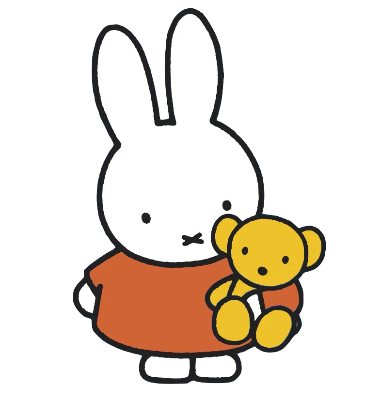
visual system development

I established a visual system inspired by Miffy’s aesthetic, including a cohesive color palette (taken from the official Miffy branding), rounded shapes, and childlike typography. I also developed reusable components such as cards, buttons, and section headers to maintain consistency across all pages.

hierarchy

A major focus of the design process was organizing content into a clear hierarchy. Instead of presenting information in long paragraphs, my creative director and I worked together to structure the site into distinct sections such as media, sightings, and shop. This allowed the homepage to function as a hub while still allowing users to explore more detailed content on individual pages.

iteration

Throughout the process, I refined alignment and interaction patterns based on feedback and testing. This included improving visual balance between sections and ensuring that interactive elements like buttons and cards felt consistent across the site.

development process

The site was built using HTML, CSS, and JavaScript. I approached development by building out each page one by one, starting with the home page, then building out each of the subpages.

layout

I first focused on creating a clear HTML structure for each page with all the content I needed. I reused patterns such as navigation, and card-based components across pages to make the site cohesive.

styling

I used CSS to implement the visual system created during the design phase. This involved keeping the color, typography, spacing, and component styling consistent. A major part of development involved making the site responsive using media queries and implementing features like a hamburger navigation menu and simplified mobile footer.

interactivity

I used JavaScript to create some interactive elements. This included modal popups for viewing maps in the sightings section and product details in the shop page, as well as horizontal scrolling carousels for products and characters.

iteration

As part of our class assignments, I continuously tested and refined the site to fix issues related to layout, and responsiveness. This included fixing alignment issues and standardizing the image sizing across different pages and components.

challenges + successes

responsive design

One of the biggest challenges was ensuring that the site worked well across different screen sizes. For my first iterations, elements such as the navigation bar and modals always felt cramped or misaligned on smaller screens. I tweaked these components using media queries and implementing a hamburger menu to improve layouts on mobile devices.

interactive components

Implementing interactive elements (e.g., the modals and scrollable galleries) needed a lot of new implementation and structure. I had issues getting the initial versions to work. After iterating several times and consulting external sources (including tutorials, articles, and AI), I refined these components to ensure they functioned smoothly across pages.

successes

Despite these challenges, I was able to successfully create an interactive microsite that functions as I initially hoped. The final site has responsive layouts and engaging features for users such as modals and carousels.

use of ai

I used AI for the following parts of my process:

final reflection

This project helped me connect designing with creating a technical implementation of a website. I learned how to iterate based on feedback and build a user experience from the initial concept to the final product. It also strengthened my ability to translate someone else's creative vision into a real working application. I was able to gain a better understanding of how thoughtful design decisions can directly impact a user's experience.